Minimalist Style & Home Décor Tips (and Twists)
Minimalist décor is easily achievable by anyone—if they never actually move into their new place! Once the boxes get delivered and they start unpacking, it becomes harder to maintain the sleek sophistication of an empty space. But all is not lost: keeping the basics of minimalist style in mind while embracing its flexibility makes it accessible to even the novice home stylist.
Why Minimalism, and Why Now?
From Marie Kondo’s purging advice to the Swedish Death Cleaning craze, the concepts of minimal living have been thrust into the spotlight, influencing many aspects of interior design and home décor. But these trends have been around for a while now: you rarely hear anyone mentioning that something “sparks joy” unless they’re saying it ironically. Minimalism is a timeless aesthetic, but is it still on-trend? Two popular movements suggest it will continue to appeal to consumers.
- First, the mindfulness movement shows no signs of abating. A stated purpose of minimalist design is we clear the physical space to clear our minds, and mindfulness is all about freeing the mind of clutter. A recent CDC study found that the use of meditation by US adults increased from 4.1% in 2012 to 14.2% in 2017. Businesses are following this trend, with up to 52% of companies offering mindfulness training, according to a survey by the National Business Group on Health and Fidelity Investments. And the mindfulness industry is exploding, with apps such as Calm and HeadSpace becoming the most downloaded wellness apps out there. Private and corporate retreats focus on calming the mind rather than beating the IT department at paintball, and wearables that help you control your stress level are becoming increasingly popular.
- Second, the COVID-19 pandemic has reintroduced many to the benefits of simplicity. Gardening and home cooking remain popular, even with the economy reopening. And since many won’t be returning to an in-office working environment, they may be ready to make a long-term commitment to a pared-down home environment.
Changing up that Austere Aesthetic
Minimalism has a few must-follows: clean lines, a lack of clutter, a neutral colour palette, and an abundance of natural light. A classic minimalist home is easily recognizable as one you’d never bring your energetic new puppy to, even if Mr. Nibbles has just come from the groomer. That said, it’s not a rigid style: there’s room for flexibility, and the right décor options can make it a fun and creative design adventure. Let’s put on a pair of tasteful, neutral-coloured loafers and take a walk to the wild(er) side of minimalism, creating a space that mingles functional simplicity with inviting intrigue!
Colour it, and not with pastels!
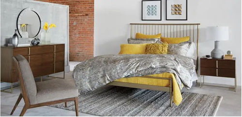 Classic minimalist design is starkly white, with maybe one or two items to add a pop of colour. But while there are reasons for this, a solid white living space doesn’t work for people who like spaghetti or who want to see where one object ends and another one begins. An alternative approach is warm minimalism (as seen in the photo on the left) that incorporates larger swaths of bright colour. Strategies like colour-blocking and solid-coloured drapes and pillows can keep you in the minimalist domain, as can using colours that complement the neutral base of the space rather than competing with it.
Dip into Wabi-Sabi
 Wabi-Sabi is the Japanese aesthetic that celebrates beauty in imperfection. It features natural elements, hand-made items, and pieces with apparent signs of use like wear, rust, or missing parts. There’s a lot of overlap between Wabi-Sabi and minimalism in that they both stress carefully chosen furnishings and décor so that every piece has meaning and function.
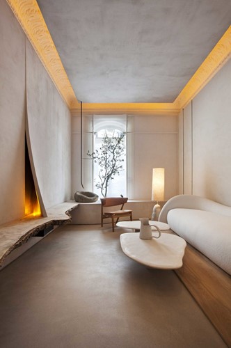
Lorna de Santos’ design offers clean lines and smooth surfaces paired with a raw-edge ledge that supports a purposely warped wall (see image on the left). The irregular curves of the coffee tables, which look like natural slabs of stone, complement the structured symmetry of the couch. The raw, imperfect finish on the ceiling and walls stands in sharp contrast to the sophisticated polish of the illuminated crown moulding. Although this space is executed with skill and precision, embracing imperfection is within the design capabilities of most people. And it can be a liberating option!
House plants are another popular feature within Wabi-Sabi spaces, delivering natural asymmetry, unique imperfection, and botanical calm. Potted plants – whether real or faux – nested within a woven basket or textured planter bring genuine charm to a minimalist space.
Imagine taking some of the rustic elements of cottage core or shabby chic (ah, the memories!) and transporting them into a sleek minimalist space. It could even put the joy back in cleaning out grandma’s attic, hitting the flea markets on the weekend, or checking out the “free stuff” on Craigslist (seriously, you never know—just take a friend with you).
Use Small Spaces for Inspiration
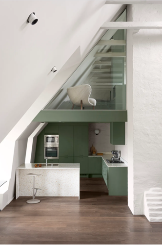 Whether it’s out of necessity or out of choice, many people are moving into smaller homes. Because a small, cluttered space is unmanageable, these dwellings need to conform to minimalist principles. Everything needs to do double-duty as storage + something else, all the elements need to blend into a cohesive vibe, and each piece that comes into a space must be selected with intent. Sanna Wåhlin designed this apartment (as seen on the left) by carrying the colour and cabinetry through from the kitchen to the loft, creating a sense of continuity and height.
The plush upholstery and rounded edges of the chair suit the comfort you expect in a sleeping loft, while the sleek functionality of the kitchen makes it look clean and efficient. A small plush rug or a luxurious throw can also add texture without cluttering or overpowering the clean lines of a small space.
The custom ash cabinets in Wåhlin’s space are painted in a nature-inspired sage, and the stucco on the walls is consistent with the imperfections of Wabi-Sabi style. The choices made for this apartment create a calm and cohesive feel that’s still functional and warm. Small spaces like this are wonderful sources of ideas for minimalist design, whether you’re decorating a tiny apartment or a larger home.
Accessorize!
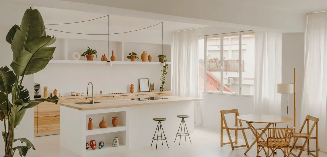
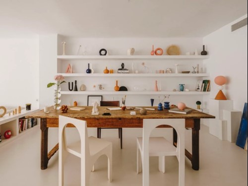 The minimalist rulebook tells us that every item in a space must serve a function (optimally several functions) and that more than a few décor items is verboten. In their own home (as seen on the left), Isern Serra and Valeria Vasi keep the clean lines and neutral palette of a typical minimalist space. Still, they teeter outside the rulebook by displaying many of Vasi’s ceramic pieces. The pieces are scaled similarly, have curves and angles that fit together, and the glazes are in a select few neutral hues to keep things simple. The individual items in this space work cohesively together to create a calm backdrop for the minimalist furnishings. Thanks to their soft, natural lines and tones, ceramics, like this classic terracotta piece, are a popular minimalist décor choice.
Minimalist style is constantly evolving, and with each incarnation, designers and consumers have more options. Retail spaces and retailer websites can facilitate those choices by highlighting the versatility of their offerings and how they might work in minimalist areas.
References:
Increase in yoga and mindfulness https://www.cdc.gov/nchs/pressroom/nchs_press_releases/2018/201811_Yoga_Meditation.htm
Businesses offering mindfulness training https://www.forbes.com/sites/forbeshumanresourcescouncil/2020/10/05/increasing-mindfulness-in-the-workplace/?sh=510064e06956.
Photo credits:
Warm minimalism: Ethan Allen (https://www.ethanallen.ca/en_CA/shop-decor-pillows-throws-pillows/blooming-floral-pillow/065751.html)
Wabi-Sabi: Design by Lorna de Santos (https://www.yellowtrace.com.au/wabi-sabi-vibes-residential-installation-lorna-de-santos-casa-decor-2020/)
Small space: Design by Sanna Wåhlin, photography by Jesper Mellgren for Architectural Digest (https://www.architecturaldigest.com/story/stockholm-kitchen-loft)
Accessorize: Design by Isern Serra and Valeria Vasi, photography by Salva López for Architectural Digest. (https://www.architecturaldigest.com/story/this-barcelona-home-studio-showcases-plenty-of-art)


